Sunday, July 17, 2011

Correlation Matrix

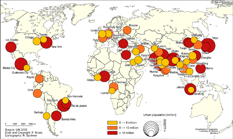
http://www.aanda.org/index.php?option=com_image&format=raw&url=/articles/aa/full_html/2010/02/aa12104-09/img26.png


A correlation matrix is one that links all sets of data by presenting them together. This correlation matrix shows multiple values and compares each one side by side.

Similarity Matrix

http://www.scielo.cl/fbpe/img/ejb/v10n4/a10/ap2b.jpg


A similarity matrix is a matrix of recorded data and two separate means of information and compares their numerical data.

Stem and Leaf Plot

http://www.mathsisfun.com/data/images/stem-leaf-plot.gif


A stem and leaf plot is one that shows numerical values that stem off but the original is also presented and preserved. Numbers are placed in such a way to keep organization and to keep groupings together.

Box Plot

http://sphaerula.com/legacy/R/boxplotTwoWay.png


A box plot is a way of graphing to show numerous sums for different groups of data. There may also be values that do not fit into the numerical values shown in the box, and these are called outliers and may also be presented.

Histogram

https://visualization.hpc.mil/wiki/images/9/98/ParaviewHistogram.png


A histogram is a graph that presents the data dealing mainly with density. Information is laid out close enough to each other to make it easier for comparison.

Parallel Coordinate Graph

http://vis.lbl.gov/Vignettes/Drosophila/3DParallelCoordinates.png


A parallel coordinate graph is one that compares given values by placing them parallel to each other on the graph. This graph uses different colors to compare the values and places them parallel to each other for easy comparison.

Triangular Plot


A triangular plot is a plot that presents three different variables on each corner and plots the given information. This plot uses three different colors to present the information.

Windrose

http://www.vistadatavision.com/uploads/images/reports/wind_rose_vector_1.png


Windrose is a tool to measure the changes in wind speed and direction. This windrose shows that 13% of the wind was going almost directly east.

Climograph

http://www.sci.uidaho.edu/scripter/geog100/lect/06-climates/low-lat-climates/7-12-climograph-tropical-wet-dry.jpg


A climograph is a graph that deals with the climate of a given area. The main topics that are researched are the amount of rain and changes in temperature.

Population Profile

http://www.co.nezperce.id.us/Portals/0/Planning%20and%20Building/ComprehensivePlan/fig_9-3.jpg


A population profile is a graph that compares the different ages across a population. This graph compares the ages in a given population in the years 1970, 1980, and 1990.

Scatterplot

http://informationandvisualization.de/files/scatter_final2.png


A scatterplot is a type of graph that shows trends in information. There is no real order to the graphing of information, everything is scattered on the plot.

Index Value Plot

https://blogger.googleusercontent.com/img/b/R29vZ2xl/AVvXsEhG-BbkCA5wFjjPMDAkSSAQJASU-EbOnZor3Mia-N3U4bxz-8q6sH0h_PQdr-vqsH9ZNHiXJO7mBBDVJqvzCxqgCASAo025V99O7ECIOnZUMLKvGLi0MGuhiOBPY6_kgqKWRqSMINlvh_yE/s320/Value+Index+Plot_image.png

The index value plot is a graph that plots different values and uses different colors etc to compare data. This plot compares six countries and their index values.

Lorenz Curve

http://www.maxi-pedia.com/web_files/images/LorenzCurve.jpg


A Lorenz curve is one that presents the information about a given areas inequality rate. The numbers are graphed according the percentage of income in that given population and compared the the percentage of that population.

Bilateral Graph

http://www.dfid.gov.uk/PageFiles/12560/Fig-9.gif?epslanguage=en


A bilateral graph is one that compares two or more different but related topics and the information is presented side by side on a graph to make it easier to compare values.

Nominal Area Choropleth Map

http://visualecon.wpengine.netdna-cdn.com/wp-content/uploads/2010/05/top_income_tax_rates_display.jpg


Nominal area choropleth maps are those that present information with nominal data. This map has the numerical value on the map itself.

Univariate Choropleth Map

http://www.waterplan.water.ca.gov/docs/portfolio/faf_data/precip/precip_1998_w-percent.jpg


Univariate choropleth maps are those that present just one set of data as opposed to the bivariate that presents two sets of information on one map. This map has one set of data, different values of rainfall in California in the year 1998.

Standardized Choropleth Map

http://4.bp.blogspot.com/_f1pDtZIbJo8/TObg_BDnYYI/AAAAAAAAAGA/Gg2FZjn0e3Q/s1600/standardized%2Bchoropleth%2Bmap.gif


Standardized choropleth maps are choropleth maps that allow comparison over different areas presented on the map. This standard map has different colors to show the different amount of population.

Unstandardized Choropleth Map

http://www.globalchange.umich.edu/globalchange1/current/lectures/kling/water_nitro/USAacid_rain2.gif


Unstandardized choropleth maps use numbers whenever possible to display information. This map has the information given at the end of each line by presenting the numbers on the map itself to show different pH levels.

Bivariate Choropleth Map

http://www.acsu.buffalo.edu/~cconlee/Map%206.1.jpg


A bivariate map gets its name because there are two different variables being displayed on the map. This map is bivariate because the different circles are showing percent of population over 25 without a high school diploma and the different colors are showing percent of population below poverty level.

Unclassed Choropleth Maps

http://support2.dundas.com/OnlineDocumentation/RSMap/Images/DesigningMaps4.bmp

Unclassed choropleth maps are choropleth maps without specific categories. These maps still use color to present their data. 

Classed Choropleth Map

http://my.ilstu.edu/~jrcarter/Geo204/Choro/CIESIN-2003/US-map-65-default.jpg


Classed choropleth maps are maps that are mainly for using different colors or shading to present different classes.

Range Graded Proportional Circle Map

http://www.personal.psu.edu/users/a/g/agc135/486/Lesson8/Lesson8_Files/Graduated.gif


Range graded proportional circle maps is the same kind of thing as proportional circle maps but presents different groups of information. This range in size of the circles presents more or less amount of the information being presented.

Continuously Variable Proportional Circle Map

http://go.owu.edu/~jbkrygie/krygier_html/geog_353/geog_353_lo/geog_353_lo11_gr/menard_grad.jpg


Continuously variable proportional circle maps are just like proportional circle maps but present information that is frequently changing. Information that could be changing frequently can be population, etc.

DOQQ

http://www.utexas.edu/depts/grg/hudson/grg360g/EGIS/labs_04/Lab3/Figures/cuero_doqq.jpg


DOQQ's are digital orthophoto quarter quads. DOQQ's can also be classified as infrared photos.

DEM

http://www.sciencegl.com/gis_dem/map_dem_gis_3d_b.jpg


DEM stands for digital elevation maps. Different colors are used to show different elevations in the given area.

DLG

http://www.dlg.nsw.gov.au/DLG/DLGImages/dlg_MapRegion.gif


DLG stands for digital line graph. Lines are drawn on a map to present the given data. This map has lines to section off the different counties.

DRG

http://www.mapmart.com/images/DEM/TextureMap250kDRG.gif


DRG stands for digital raster graphic. DRG's are used on maps by adding graphics to present some information.

Isopach

http://4.bp.blogspot.com/-AFmwgUp73ZA/TbDavVXdmpI/AAAAAAAAACI/sfgXZpjoQyQ/s1600/isopach+1.jpg


Isopachs are drawn on a map to show the amount of thickness of the presented land. This map has different colors to present the different amounts of thickness in the northeastern area of the United States.

Isohyets

http://www.fao.org/ag/AGP/AGPC/doc/Counprof/mauritania/mauritania.htm


Isohyets are drawn on a map to show areas with the same amount of rainfall. This map shows the different areas and also numerical values that had the same amount of rainfall across this country.

Isotachs

http://www.erh.noaa.gov/btv/events/28Oct2008/ua2.php


Isotachs are used on maps to show different areas of wind speed. The lines are drawn by mapping wind speed and the lines connect those with equal wind speed.

Isobars

http://pangea.tec.selu.edu/~cboylan/etec644/weather3.html


Isobars are used on a map to show different levels of atmospheric pressure. The H's stand for areas with high pressure and the isobars around them present the changing levels of pressure.

LIDAR

http://www.saic.com/geospatial/images/lidar1.jpg


LIDAR stands for Light Detection and Ranging. This map uses different colors to show the height of buildings in the area. The red buildings are lower and the royal blue are buildings that are high in elevation.

Doppler Radar

http://www.magazine.noaa.gov/stories/images/wea01269_small.jpg


A doppler radar is a radar that uses technology to scan the environment and inform us if there is something in the air, such as rain. This map shows the amount of rain that the radar found in the environment and the different colors show the amount of expected precipitation.

Black and White Aerial Photo

http://pubs.usgs.gov/of/1995/of95-017/images/PearlHarborAerial.jpg


Black and white aerial photos are another kind of photography like infrared photos to show large amounts of land from above. This picture was taken from above to show where dredging took place around Pearl Harbor.

Infrared Aerial Photo

http://www.sciencephoto.com/image/179411/530wm/E7700321-Infrared_aerial_photo_showing_vegetation_patterns-SPL.jpg


An infrared aerial photo is a photo taken to show amount of vegetation. This photo was taken from a plane or helicopter to show the area where farming takes place.

Cartographic Animation

https://blogger.googleusercontent.com/img/b/R29vZ2xl/AVvXsEg-mvuBHtG7ZAFxjNtZklGF6FXGnpQXgumJi0YCPCK0HgNZm_LkH3K5A9PqpAiqeKAYRMgeOLH0vvBzTPPAWWm7BqtnW32xAYic0PAgNJIc-gLm9ZMjGYWVnwgkF3DgKYm_ypiLLkDJmgs/s1600/cartographic+animation.gif


Cartographic animations are animations drawn on a map to show information. One such animation may be a certain type of weather, such as a hurricane.

Statistical Map

http://www.megacities.uni-koeln.de/documentation/megacity/map/MC-2015-PGM.jpg


A statistical map is one that shows a numerical data on a map. A dot distribution is a type of statistical map.

Cartogram

http://upload.wikimedia.org/wikipedia/commons/4/47/Cartlinearlarge.png


A cartogram is a map that skews the picture to show a larger or smaller amount of what is being presented. This cartogram shows how each county voted in the 2004 election. The areas skewed to look larger are those that had more people voting for a certain candidate.

Flow map

http://infosthetics.com/archives/flow_map_layout.jpg

Flow maps are those that are designed to help someone figure out the flow of information. In this case, the flow map is showing the flow of information across continents.

Isoline Map

http://www.forestpal.com/images/su_isoline_map.gif

An isoline map uses lines to show different values and those lines may also be different colors to show different values as well. This map shows the different temperatures around this state. The red areas are areas of warmer weather, and the blue are areas of colder weather.

Proportional Circle Map

http://personal.frostburg.edu/sbriggs0/USA_GradCirclefinal.jpg

A proportional circle map shows information by using different size circles to show a larger or smaller amount. This map uses different size circles to show the amount of Walmarts in each state. The larger circles mean that there is a large amount of Walmarts in that state; the smaller circles mean there are fewer Walmarts.

Choropleth Map

http://my.ilstu.edu/~jrcarter/Geo204/Choro/Tom/hispanic_race_fl-H1_FINAL.gif

A choropleth map is a map that sections off certain areas according to the given information and uses color to show the different information. This map has sectioned off the state of Florida by county and uses different colors to compare the percentage of Hispanic people in each county.

Dot Distribution Map

http://www.engin.umich.edu/dept/name/oel/popmapn.jpg

Dot distribution maps use dots to express an amount of something in a given area. This map shows the amount of population in the Detroit area. The massive amount of yellow shows that there is a large population in that area.

Hypsometric Map

http://www.izera-darksky.eu/izera/granice_obszaru.jpg

A hypsometric map is one that shows different elevations. This map shows the different elevations by using different colors, the red shows areas of higher elevation and the green shows areas of lower elevation.

Friday, July 15, 2011

PLSS Map


http://www.utah.gov/maps/images/map-thumb-plss.png
A PLSS map stands for a public land survey system. This PLSS map shows an area of Utah that they have sectioned off to show who owns what area.

Cadastral Map


http://upload.wikimedia.org/wikipedia/commons/4/4b/Old_cadastral_map_of_Praha-Josefov_and_surround_areas.jpg
A cadastral map is one which shows ownership of land. This map has each area of ownership squared off and marked with a number to specify who owns it.

Thematic Map

http://www.infousagov.com/images/choro.jpg

A thematic map is one that deals with the root word, theme, of a given area. The above map sticks to the theme of showing areas with the most new businesses in the year 1999. The legend to the bottom right shows different colors with areas with zero new businesses to areas with over 7,000 new businesses.

Planimetric Map

http://fsu.campusrec.com/img/campusmap2.gif

A planimetric map shows the features of an area without being specific about the elevation of how those features relate to each other. This planimetric map shows where all of the campus recreation areas are around FSU's campus. By giving street names and surrounding buildings, it is easy to find where these recreational areas are.

Topographic Map

http://upload.wikimedia.org/wikipedia/commons/thumb/d/d8/Hawaii_Island_topographic_map-fr.svg/728px-Hawaii_Island_topographic_map-fr.svg.png

A topographic map is one that shows detail and relief by using contour lines to represent different heights above or below sea level. This topographic map shows that this Hawaiian island has two peaks at heights between 4100 and 4200. Also it shows that the area surrounding the island is higher than the ocean floor.

Mental Map

http://www.mindtools.com/media/Diagrams/mindmap.jpg

This mental map conveys how this person manages their time. He or she branches out his or her time into certain aspects such as communication, key issues, or choices that may be made.