A climograph is a graph that deals with the climate of a given area. The main topics that are researched are the amount of rain and changes in temperature.
A population profile is a graph that compares the different ages across a population. This graph compares the ages in a given population in the years 1970, 1980, and 1990.
A scatterplot is a type of graph that shows trends in information. There is no real order to the graphing of information, everything is scattered on the plot.
The index value plot is a graph that plots different values and uses different colors etc to compare data. This plot compares six countries and their index values.
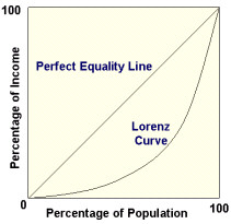
A Lorenz curve is one that presents the information about a given areas inequality rate. The numbers are graphed according the percentage of income in that given population and compared the the percentage of that population.
A bilateral graph is one that compares two or more different but related topics and the information is presented side by side on a graph to make it easier to compare values.